

For nearly 460 years, generations have looked at a map of the world without necessarily realising that they were looking at a mathematical compromise. The familiar world map was never designed to show the true size of countries and continents. It was created primarily to help sailors navigate.
Yet a navigational tool gradually became something much more powerful: the mental picture through which billions of people came to visualise the world.
The story begins in 1569, when Flemish cartographer Gerardus Mercator published his famous world map. His cylindrical projection solved an important problem for sailors. It represented lines of constant compass bearing as straight lines, making ocean navigation considerably easier.
For navigation, it was brilliant. For comparing the actual sizes of landmasses, however, it was deeply misleading.
The distortion increases dramatically towards the poles. At 45 degrees latitude, areas appear roughly twice their actual size; at 60 degrees, roughly four times larger; and at 70 degrees, more than eight times larger. The result is familiar to anyone who has studied a conventional world map: Greenland appears enormous, Russia stretches across a huge portion of the northern hemisphere, Europe looks disproportionately large, while Africa and India appear considerably smaller than their actual areas.
The most striking example is Greenland. On the Mercator map, it can appear comparable to Africa. In reality, Africa is about fourteen times larger.
That difference matters—not because the map is “wrong” in its intended navigational purpose, but because its use gradually expanded far beyond navigation.
When a Sailor’s Map Entered the Classroom
The Mercator projection moved from ships into atlases, classrooms, government offices, newspapers, and eventually television and digital media. Children were rarely told that the map was deliberately distorting area to preserve angles.
Instead, they simply learned that this was what the world looked like.
That distinction is important.
Maps do not merely describe geography. They also frame it. When a particular representation is repeated for generations, it can influence how people intuitively understand distance, size, location and importance.
There is an additional historical irony. Many of the major European powers of the colonial era were located in the northern latitudes where Mercator’s distortion was greatest, while many territories they colonised were closer to the Equator.
Britain, France, Germany and Russia appeared visually expansive. India, much of Africa and large parts of Southeast Asia and Latin America appeared relatively smaller.
The map certainly did not create colonial power. European empires were built through military strength, economic resources, political institutions and technological advantages. But the visual language of the map could reinforce an existing hierarchy: the powerful appeared larger, while many of the colonised regions appeared smaller.
Over time, geography could become psychology.
The Illusion Survives the Empire
Colonial empires eventually disappeared. Their flags changed. New nations emerged. Yet the familiar map remained.
The digital revolution did not automatically correct the problem. Mercator-derived projections continue to be useful for web mapping because of their mathematical properties, particularly for displaying navigation-related information.
The irony is that the projection’s original purpose remains valid even though its popular use as a general-purpose picture of the world can be misleading.
The facts are revealing.
India is larger than Greenland. Africa is vastly larger than Europe and North America individually. South America is considerably larger than the United States. Russia is the world’s largest country by area, but Africa is still substantially larger than Russia.
Nothing changed on Earth when these comparisons became clearer. Only the representation changed.
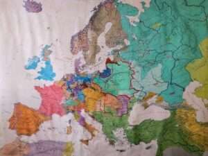
A New Way of Seeing the World
The growing recognition of this problem has encouraged the use of alternative projections, particularly equal-area projections, which preserve the relative sizes of landmasses more faithfully.
One prominent example is the Equal Earth projection, introduced in 2018. It sacrifices some of the properties valued in navigation in order to provide a more realistic visual comparison of continental areas.
This distinction is crucial. There is no single “perfect” world map. Every projection involves compromises. Some preserve angles, some preserve area, some preserve distance, and others attempt to balance several properties.
The real issue, therefore, is not whether Mercator should disappear. It is whether people should understand what they are looking at.
A map designed for navigation should not automatically become the default mental model for understanding the relative size of continents.
The Larger Question
This leads to a more profound question.
If a mathematical projection can influence how generations visualise geographical importance, what other inherited representations shape the way societies understand themselves?
Colonialism did not leave behind only political borders and economic structures. It also left intellectual and cultural frameworks.
Ideas about what constitutes “modernity”, whose knowledge is considered authoritative, what a successful city or economy should look like, and which societies are described as “developed” or “developing” can carry historical assumptions.
The danger is not that every Western idea is inherently colonial or wrong. That would simply replace one form of intellectual rigidity with another.
The challenge is to question the assumption that there is only one centre from which knowledge, progress and modernity must radiate.
For Bharat, this is particularly relevant. For decades, Indians have often viewed their own civilisation, institutions and achievements through frameworks developed elsewhere. The result can sometimes be an unconscious tendency to regard Bharat as a society that is perpetually “catching up”, rather than one capable of defining its own benchmarks.
Correcting the Map—and the Mind
The lesson of Mercator is ultimately simple.
A map is not the territory.
It is an interpretation of the territory, created for a particular purpose.
Mercator’s projection was an extraordinary achievement of mathematics and cartography. Its distortion of area was not a conspiracy, nor was it designed as colonial propaganda. But its subsequent dominance as a general picture of the world produced a visual imbalance that many people never questioned.
That is why correcting the map matters.
But correcting the map is only the beginning.
The more important task is to examine the invisible maps inside our heads—the assumptions about who is central, who is peripheral, who leads and who follows, whose knowledge matters and whose achievements deserve recognition.
The world itself never needed correcting.
Perhaps it was our way of seeing it that did.
And perhaps the most important map we need to redraw is not hanging on a classroom wall at all. It is the one we carry within ourselves.